Category: musings

  • new and improved, kinda

    So this week I decided it was time to just bite the bullet and buy myself a new camera body! I love the lenses I use (Sigma 30mm f/1.4 and 17-70mm f/2.8-something) but I felt like it was time for a body upgrade. The body I was using, a d40, has been discontinued for awhile now and I’ve been ogling a new one for the last few months! I got a Nikon d5000.

    This is definitely a fair upgrade – double the megapixels, Live View, takes HD video, great sensor, but still in a more compact body than the spendy-but-awesome d90. There were a few things that made me choose the d5000 over the d90. Price was a big one, the d5000 being more than a couple hundred dollars cheaper. I’m used to the display of the d40 and the d5000 is quite similar, and the size and shape are similar as well. The d5000 is a touch bigger than my old camera, but not as big as the d90. Since I have teeny tiny hands that’s important to me! (Although of course if someone wanted to sell me a d90 for the same price or something I certainly wouldn’t refuse). The d5000 also has an interval timer, meaning you can take more than one timed shot at a time.

    One of the biggest things that sold me on the d5000 was the “vari-angle” LCD screen. This means the screen flips out and rotates. Perfect for self-portraits, or in my case most of the time, knitting pattern shots! So cool, right? Well…
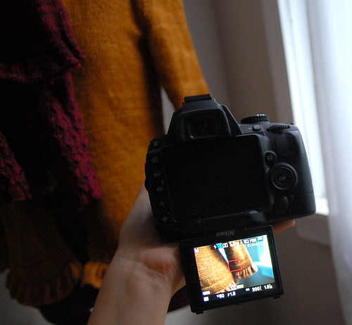
    I got a new camera but

    The LCD screen hinges from the bottom. Which is great if you want to say, use the live view and the LCD to hold the camera up high and still see what the camera sees. But it’s going to be useless for my self portraits. Can you see why? Yup, it won’t play with a tripod. You can’t put the camera down on something and still see the screen. This was a pretty poor choice on the part of Nikon – the screen should have hinged from the side, making it available at pretty much all times.

    So overall I’m happy with the photos, and the displays, and I’m happy I bought this camera. But I really, really wish that the LCD could have been used as I imagined – mounted on a tripod, able to see myself and make sure I was in the photo and what the framing looked like. Oh well. It does take pretty photos! The first thing I noticed was that the colours were much easier to capture and truer to life, straight off the camera. I haven’t had a lot of time to play with it yet, but a couple of knitting photos:

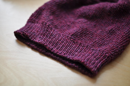
    swap hat

    (A hat for a swap we’re doing at Rhinebeck! So excited! THREE WEEKS!)

    third rhinebeck sweater

    This colour, Madelinetosh’s Composition Book Grey, was pretty tricky for my old camera. With the new one, presto!

    I’m trying to get this sweater done in time for Rhinebeck – the sleeves are done, but I keep having to restart the body. Even just now I looked down at it and realized I should’ve done more hem shaping. Once I think of something like that, I can’t just let it pass, so I guess I’m ripping yet again!

  • cityscape, the first

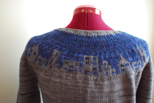
    Since my Cityscape sweater pattern has been up on Twist for a little while now, I though it was high time I told you about how it came about! I just took these photos and the sweater’s a bit rumpled from being in the closet all summer – but it’s sure to get worn this autumn.

    Last winter I had the idea of a circular yoked sweater with a skyline around the yoke. Bottom-up circular yoke cardi? Easy for me to work up. But it took a bit of trial and error to get the chart just right. I looked at various actual skylines, skyline line drawings, and other graphic representations, but in the end I just made a grid up in Illustrator and painted in the squares until they looked right.

    For yarn, I had 2 colours of Dream in Color Classy that I wanted to use – grey for the main colour, and a deep blue (Midnight Derby) for the background of the skyline. These colours are pretty subtle against each other – the skyline isn’t in as high contrast as it is in the Blue Moon BFL version.

    I knit up the first one very quickly in February 2010 – here it is!

    Cityscape, the prototype

    There are lots of differences between my first prototype and the final version that ended up in Twist. This first one was knit in quite a heavy worsted weight, superwash yarn. The gauge is 5 stitches per inch, and I had a 50-stitch skyline chart. Also, I ended up knitting this version back and forth, including the colourwork (the sleeves were in the round though). Purling colourwork? Tricky. Especially as this type of motif isn’t as rhythmic as more traditional fair isle type patterns, and the repeat was so big!

    Cityscape, the prototype

    Cityscape 1.0 has more buildings that are different heights, which necessitated weaving the yarns in between the taller bits. I always find weaving a little bit annoying, but I know how to do it more easily from the knit side – from the purl side, whew, it was really fiddly! Once I was done though, I was really happy with how my concept had turned out. Only then did I sketch it up and submit it to Twist for the fall issue.

    The Blue Moon BFL sport that I used for the Twist version is very different in character from the Dream in Color, and I loved knitting with it – it’s a tiny bit hairy, really wooly, but soft. And the colours worked out great! I knew that I wanted to do a thinner gauge, because it would be easier to see the buildings. I do kind of like that my worsted weight version looks a little less like a pattern up close, and the skyline is more apparent when you stand back a bit, it’s like a bit of a surprise! But with the thinner yarn and a slightly pared down chart (40 stitches) I could have more sizing options and make it a bit easier to knit.

    I knew I wanted to do a steek for the Twist version, because that purl colourwork really was a pain, and it was difficult to get the tension right. It was my very first real steek, and it went totally fine! I sewed the steek down by hand and just went for it. Even if you’re scared of steeks, I’d highly recommend trying it out. Plus, at least the body portion of the sweater is all solid, so it isn’t quite the same as cutting up a colourwork-all-over sweater!

    Cityscape, the prototype

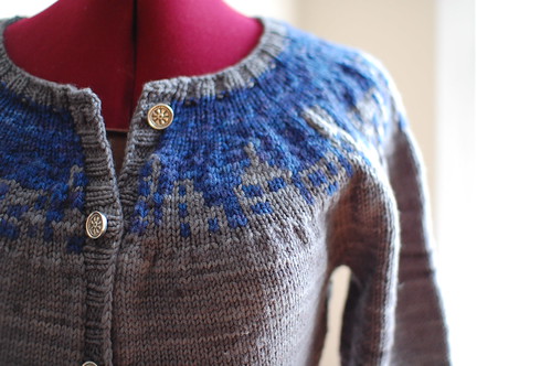
    With these darker colours I went for pretty pewter buttons – I really like them.

    So, overall, Cityscape 1.0 really was a prototype. I was really happy to be able to contribute this concept to Twist, and even happier that because I knit this initial version, I was able to make the final pattern that much better! Of course, I can’t wait for sweater weather so I can get some more wear out of mine.

  • aguas sweater, part 1

    I’m busy busy finishing up a big Secret Project, but of course since that’s nearing completion I’m thinking ahead to the next thing! I thought it might make for some interesting blogging if I work through the idea and execution with you all. I can’t promise it’ll be done soon or anything, but anyway. Onwards! Today – concept and construction notes.

    a new sweater idea!

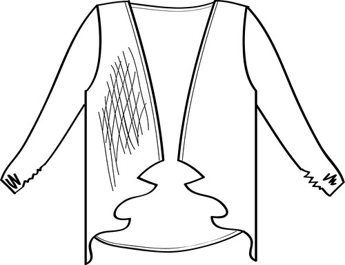
    So here’s the sketch of my idea. I had the a while ago – it’s not a revolutionary sweater concept of course, I’m sure everyone’s seen (or owns) a cardigan like this! It’s also similar in shape to my Rayne Wrap Cardigan that I released nearly three (whoa) years ago.

    One big difference with this sweater – the working title of which shall be “aguas” – is that it has set-in sleeves and seamed shoulders. This will help it sit better on the tops of the shoulders, and means a better fit through the sleeve and shoulder. I haven’t quite decided how I want to do the sleeve yet, but I’m thinking a fairly slim fit and perhaps ending just below the elbow.

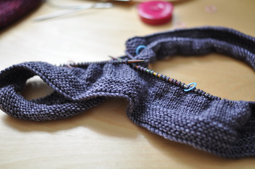
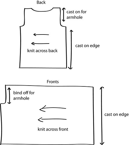
    Aguas will be knit from side to side, like Rayne, but in pieces to be seamed together. It’ll have the traditional cardigan pieces of a back, two fronts, and two sleeves, but knit from side to side. I drew up a quick schematic of how I’m planning to make the shaping work.

    schematics/concept

    As you can see I’ll be casting on at the centre front and work across to the armhole and side seam. The fronts are long and extended for the drapey ruffle at the front. Many of the storebought versions of this shape have sort of a shawl collar at the back of the next that extends down the fronts, but this one will be more straight down without a collar.

    I want to use a lighter weight yarn with this incarnation, so I’m going with Malabrigo Sock in, you guessed it, the colour Aguas! I’m afraid I’m not very creative with working titles.

    Up next – knit this whole sweater in fingering weight stockinette? I do love stockinette, but maybe not that much. So stitch pattern ahoy!