Since my Cityscape sweater pattern has been up on Twist for a little while now, I though it was high time I told you about how it came about! I just took these photos and the sweater’s a bit rumpled from being in the closet all summer – but it’s sure to get worn this autumn.
Last winter I had the idea of a circular yoked sweater with a skyline around the yoke. Bottom-up circular yoke cardi? Easy for me to work up. But it took a bit of trial and error to get the chart just right. I looked at various actual skylines, skyline line drawings, and other graphic representations, but in the end I just made a grid up in Illustrator and painted in the squares until they looked right.
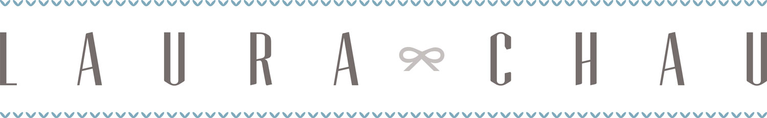
For yarn, I had 2 colours of Dream in Color Classy that I wanted to use – grey for the main colour, and a deep blue (Midnight Derby) for the background of the skyline. These colours are pretty subtle against each other – the skyline isn’t in as high contrast as it is in the Blue Moon BFL version.
I knit up the first one very quickly in February 2010 – here it is!

There are lots of differences between my first prototype and the final version that ended up in Twist. This first one was knit in quite a heavy worsted weight, superwash yarn. The gauge is 5 stitches per inch, and I had a 50-stitch skyline chart. Also, I ended up knitting this version back and forth, including the colourwork (the sleeves were in the round though). Purling colourwork? Tricky. Especially as this type of motif isn’t as rhythmic as more traditional fair isle type patterns, and the repeat was so big!
Cityscape 1.0 has more buildings that are different heights, which necessitated weaving the yarns in between the taller bits. I always find weaving a little bit annoying, but I know how to do it more easily from the knit side – from the purl side, whew, it was really fiddly! Once I was done though, I was really happy with how my concept had turned out. Only then did I sketch it up and submit it to Twist for the fall issue.
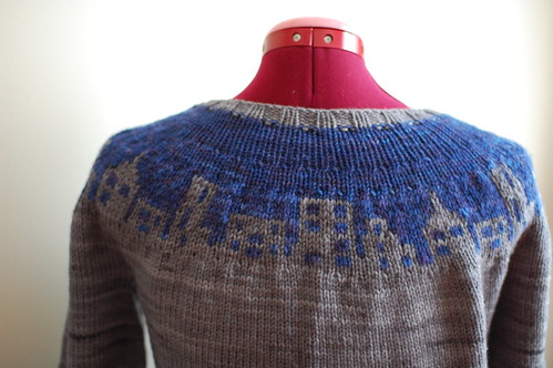
The Blue Moon BFL sport that I used for the Twist version is very different in character from the Dream in Color, and I loved knitting with it – it’s a tiny bit hairy, really wooly, but soft. And the colours worked out great! I knew that I wanted to do a thinner gauge, because it would be easier to see the buildings. I do kind of like that my worsted weight version looks a little less like a pattern up close, and the skyline is more apparent when you stand back a bit, it’s like a bit of a surprise! But with the thinner yarn and a slightly pared down chart (40 stitches) I could have more sizing options and make it a bit easier to knit.
I knew I wanted to do a steek for the Twist version, because that purl colourwork really was a pain, and it was difficult to get the tension right. It was my very first real steek, and it went totally fine! I sewed the steek down by hand and just went for it. Even if you’re scared of steeks, I’d highly recommend trying it out. Plus, at least the body portion of the sweater is all solid, so it isn’t quite the same as cutting up a colourwork-all-over sweater!
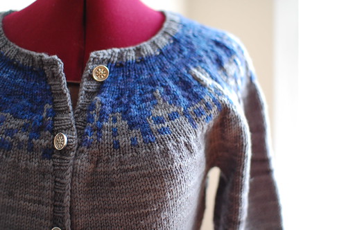
With these darker colours I went for pretty pewter buttons – I really like them.
So, overall, Cityscape 1.0 really was a prototype. I was really happy to be able to contribute this concept to Twist, and even happier that because I knit this initial version, I was able to make the final pattern that much better! Of course, I can’t wait for sweater weather so I can get some more wear out of mine.
Leave a Reply